How to Create Amazing Charts with Just a Few Words using WiseData
What if you could just write what you want to see in plain words and get a stunning chart in seconds? That’s exactly what WiseData does.
David @ WiseData · June 30, 2023
Introduction
Data is everywhere, and it can tell us a lot of things. But data alone is not enough. We need to visualize it, to make it come alive, to reveal its secrets, and to share its stories. Data visualization is the art and science of turning data into graphical or interactive forms that can capture our attention, spark our curiosity, and inspire our action.
But data visualization is not easy. It requires a lot of skills, knowledge, and creativity. It requires choosing the right type of chart, picking the best data attributes, applying the proper formatting and styling, and adding the most informative annotations and labels. And it requires knowing what your audience wants and expects from your visualization.
What if you could just write what you want to see in plain words and get a stunning chart in seconds? That’s exactly what WiseData does.
You can download the Jupyter notebook from HERE.
What is WiseData?
WiseData is a Python library that lets you visualize data with natural language. It uses ChatGPT and cutting-edge natural language processing (NLP) and natural language understanding (NLU) techniques to understand your queries and generate chart that match your intent. You can use WiseData to create many kinds of charts, such as bar charts, line charts, scatter plots, histograms, box plots, and more.
How to use WiseData?
1. Obtain an API Key
To use WiseData, you need to obtain an API Key. Simply visit https://www.wisedata.app/, fill out your email address. And the API Key used for Python package will be delivered to your email.
2. Installation
Using WiseData is super easy and fun. You need to install the library using pip.
We will install additional libraries needed as well.
pip install wisedata
pip install pandas numpy matplotlib seaborn
3. Instantiation
Then you can import WiseData and instantiate the WiseData class with your API key:
from wisedata import WiseData

# TODO: Copy your API key which you've received in your email here
wd = WiseData(api_key="YOUR_API_KEY")
4. Visualize Data with words
Let's say we have a Pandas DataFrame with the following data:
| country | gdp | happiness_index |
|---|---|---|
| United States | 19294482071552 | 6.94 |
| United Kingdom | 2891615567872 | 7.16 |
| France | 2411255037952 | 6.66 |
| Germany | 3435817336832 | 7.07 |
| Italy | 1745433788416 | 6.38 |
| Spain | 1181205135360 | 6.4 |
| Canada | 1607402389504 | 7.23 |
| Australia | 1490967855104 | 7.22 |
| Japan | 4380756541440 | 5.87 |
| China | 14631844184064 | 5.12 |
We will create a Pandas DataFrame of this data:
import pandas as pd

countries = pd.DataFrame({
    "country": ["United States", "United Kingdom", "France", "Germany", "Italy", "Spain", "Canada", "Australia", "Japan", "China"],
    "gdp": [19294482071552, 2891615567872, 2411255037952, 3435817336832, 1745433788416, 1181205135360, 1607402389504, 1490967855104, 4380756541440, 14631844184064],
    "happiness_index": [6.94, 7.16, 6.66, 7.07, 6.38, 6.4, 7.23, 7.22, 5.87, 5.12]
})
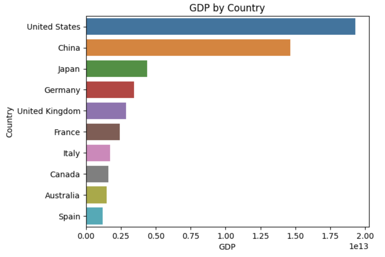
Finally, you can use the .viz() function to create a chart based on your natural language query. You just need to pass the data frame and the query as arguments. For example:
wd.viz("bar chart with country's gdp sorted by gdp descending", {
    "countries": countries
})
Voila! The bar chart with country's GDP sorted by GDP descending was created!
What are the benefits of WiseData?
WiseData has many benefits for data visualization. Some of them are:
- It saves you time and effort by automating the chart creation process, and gain insights faster.
- It allows you to express your visualization needs in natural language.
- It allows you to write more concise and readable code. People who are reading code can interpret the visualization easily.
Conclusion
WiseData is a powerful and innovative tool for data visualization with natural language. It can help you create amazing and interactive charts with just a few words. It can also help you learn more about your data and communicate your findings effectively.
If you're looking for a way to streamline your data analysis workflow, give WiseData a try @ https://www.wisedata.app!
Happy visualizing! 📊